How to Use Card-Based Layouts in Website Design
How to use card-based layouts in web design to enhance user experience, improve functionality, and create visually appealing websites with Mapleweb.
In the ever-evolving world of web design, card-based layouts have emerged as a game-changer. Whether you’re designing an e-commerce site, a portfolio, or a blog, card-based layouts offer a sleek, organized, and user-friendly way to present information. At Mapleweb, a leading web design Montreal agency, we’ve seen firsthand how this design trend can elevate a website’s aesthetics and functionality. So, let’s break down everything you need to know about card-based layouts and how to use them effectively.
What Are Card-Based Layouts?
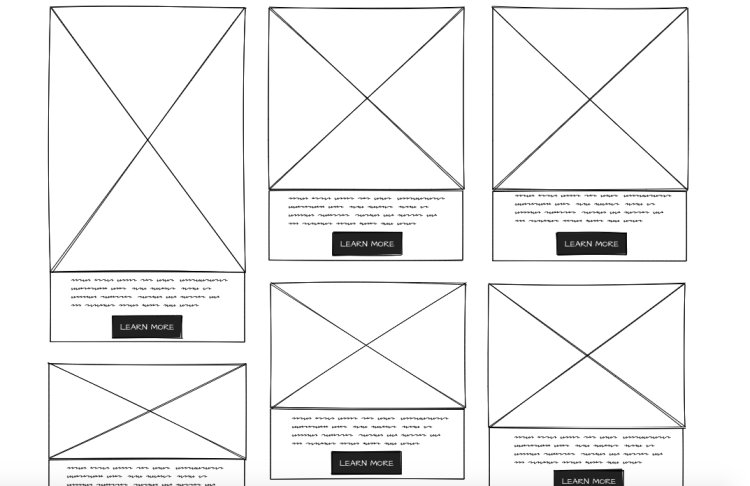
Card-based layouts are a design approach where content is divided into small, rectangular sections—or “cards”—that act as containers for information. Each card typically includes a combination of text, images, and buttons, making it easy for users to scan and interact with the content. Think of it like a digital version of a business card or a postcard, designed to deliver bite-sized information in a visually appealing way.
The Origins of Card-Based Design
The concept of card-based design isn’t new. It gained popularity with platforms like Pinterest and Twitter, which use cards to display bite-sized information in a visually appealing way. Over time, this design style has become a staple in modern web design, thanks to its ability to organize content effectively while maintaining a clean and modern look.
Why Card-Based Layouts Are Popular
Card-based layouts are popular because they’re versatile, responsive, and user-friendly. They allow designers to present information in a digestible format, making it easier for users to find what they’re looking for. Plus, they work seamlessly across devices, from desktops to smartphones, ensuring a consistent experience for all users.
Benefits of Using Card-Based Layouts
Improved User Experience (UX)
Cards make it easy for users to navigate a website. By breaking content into smaller chunks, users can quickly scan and find the information they need without feeling overwhelmed. This approach enhances usability and keeps visitors engaged, reducing bounce rates and improving overall satisfaction.
Responsive Design Made Easy
One of the biggest challenges in web design is creating a layout that looks great on all devices. Card-based layouts are inherently responsive, meaning they automatically adjust to fit different screen sizes. This flexibility ensures your website looks polished and functions smoothly, whether it’s viewed on a desktop, tablet, or smartphone.
Enhanced Visual Hierarchy
Cards help designers create a clear visual hierarchy by organizing content into distinct sections. This makes it easier for users to prioritize information and focus on what’s important. By using size, color, and placement strategically, you can guide users’ attention to key elements like calls-to-action or featured content.
How to Implement Card-Based Layouts
Step 1: Define Your Content Structure
Before diving into design, outline the content you want to include on your website. This will help you determine how many cards you need and what information each card should contain. A well-planned structure ensures your layout is both functional and visually appealing, catering to your audience’s needs.
Step 2: Choose the Right Grid System
A grid system is essential for organizing cards in a clean and structured way. Whether you use a 2-column, 3-column, or masonry grid, make sure it aligns with your overall design goals. The right grid system ensures your cards are evenly spaced and easy to navigate, creating a seamless user experience.
Step 3: Use Consistent Card Sizes
Consistency is key when it comes to card-based layouts. Use uniform card sizes to create a cohesive look and feel. This not only enhances the visual appeal of your website but also makes it easier for users to process information without distractions.
Step 4: Add Visual Elements
Incorporate images, icons, and buttons to make your cards visually appealing. Just be careful not to overcrowd them. Visual elements should complement the content and enhance the user experience, not overwhelm it. High-quality visuals can also make your website more engaging and memorable.
Step 5: Optimize for Mobile Devices
Test your card-based layout on different devices to ensure it looks great and functions smoothly on mobile screens. Mobile optimization is crucial, as a significant portion of web traffic comes from smartphones. Ensure cards are easy to tap, read, and navigate on smaller screens.
Best Practices for Card-Based Layouts
Keep It Simple and Clean
Avoid cluttering your cards with too much information. Stick to the essentials and let the design breathe. A clean and minimalist approach not only looks professional but also improves usability, making it easier for users to focus on the content that matters most.
Use High-Quality Images
Images play a crucial role in card-based layouts. Use high-quality visuals that complement your content and enhance the overall design. Blurry or poorly chosen images can detract from the user experience, so invest in professional photography or stock images that align with your brand.
Prioritize Readability
Choose fonts and colors that are easy to read. Remember, the goal is to make your content accessible and engaging. Avoid overly decorative fonts or low-contrast color schemes that can strain the eyes. Clear and legible text ensures users can quickly absorb your message.
Examples of Card-Based Layouts in Action
E-Commerce Websites
E-commerce sites like Amazon use card-based layouts to display products, making it easy for users to browse and shop. Each card typically includes an image, product name, price, and a call-to-action button, creating a streamlined shopping experience.
Portfolio Websites
Designers and photographers often use card-based layouts to showcase their work in a visually appealing way. Cards allow them to display thumbnails of their projects, which users can click on to view more details. This approach is both elegant and functional.
News and Blog Websites
News websites like The New York Times use cards to highlight articles, allowing readers to quickly scan headlines and images. This format is perfect for content-heavy websites, as it organizes information into digestible chunks that are easy to navigate.
Common Mistakes to Avoid
Overloading Cards with Information
Too much content can make your cards look messy and overwhelming. Keep it concise and to the point. Focus on delivering key information in a clear and straightforward manner, ensuring users can quickly understand what each card represents.
Ignoring Mobile Optimization
Failing to optimize your card-based layout for mobile devices can lead to a poor user experience. Test your design on various screen sizes to ensure cards are easy to interact with and read, regardless of the device being used.
Inconsistent Design Elements
Inconsistency in card sizes, fonts, or colors can make your website look unprofessional. Stick to a unified design style to create a cohesive and polished look. Consistency also helps users navigate your site more intuitively.
How Mapleweb Can Help with Web Design in Montreal
At Mapleweb, we specialize in creating stunning, user-friendly websites that drive results. Whether you’re looking for web design Montreal, logo design Montreal, or digital marketing agency Montreal services, we’ve got you covered.
Our Expertise in Card-Based Layouts
Our team of designers has extensive experience in creating card-based layouts that are both visually appealing and functional. We understand how to balance aesthetics with usability, ensuring your website delivers an exceptional user experience.
Custom Web Design Solutions
We tailor our designs to meet your unique needs, ensuring your website stands out from the competition. From concept to execution, we work closely with you to create a website that reflects your brand and achieves your goals.
Integrating Digital Marketing Strategies
Beyond design, we offer comprehensive digital marketing services to help you grow your online presence. Whether it’s SEO, social media marketing, or content creation, we provide the tools and expertise to drive traffic and conversions.
Conclusion
Card-based layouts are a powerful tool in modern web design, offering a clean, organized, and user-friendly way to present content. By following best practices and avoiding common mistakes, you can create a website that not only looks great but also delivers an exceptional user experience. And if you’re in Montreal, Mapleweb is here to help you every step of the way. Ready to take your website to the next level? Let’s get started!click
What's Your Reaction?


