

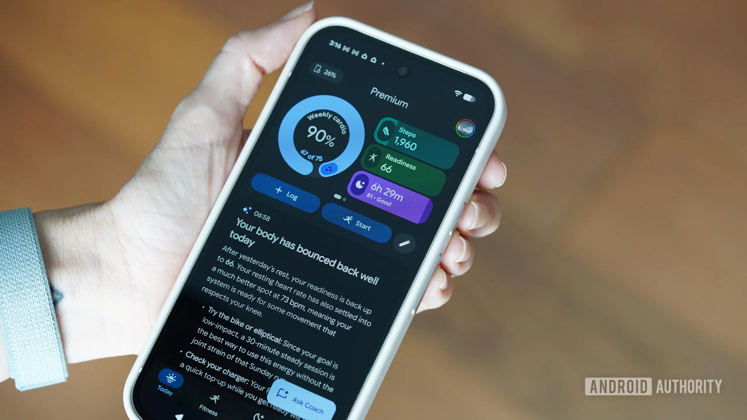
It has been just over a week since Fitbit users were forced to transition to the new Google Health app. The change brought a complete design overhaul, promising deeper integrations with Google Fit and Health Connect, along with a more centralized health experience. But early sentiment is overwhelmingly negative.
A survey conducted among over 1,500 readers revealed that 51% of respondents believe the app looks better but is significantly worse to use. Only 5% said they love the functionality but dislike the design. Just 23% found the app both visually appealing and effective. The remaining 21% were either indifferent or had not yet received the update.
Usability takes a huge step back
Many users report that basic metrics—like step counts from previous days—are now buried deep within the interface. The new design prioritizes a wall of text generated by an AI coach, often at the expense of clear, sortable graphs. Former Fitbit app allowed users to quickly glance at weekly trends, hourly step distribution, and sleep patterns. Now, locating that same data requires multiple taps and endless scrolling.
One commenter noted, "Finding most basic metrics in the Health App has become a near impossible quest. I'm still trying to find how I might discover the most basic information previously easily available such as how many steps I might have taken on the previous day." This frustration echoes a widespread complaint: the Health tab dumps everything into a single feed, forcing users to manually pin charts—a process that feels clunky and unintuitive.
The AI Coach: helpful or intrusive?
The AI coach was intended to offer personalized insights and encouragement. However, it has become a sore point for many. Users describe its daily messages as "smarmy, obsequious, condescending platitudes" that take up too much screen real estate. One long-time Fitbit user commented, "The rambling AI text is generally unhelpful and repetitive and just makes the app hard to use." Another pointed out that the AI speculates about health variables it knows nothing about, making the advice feel generic and at times irrelevant.
On the other hand, a small minority appreciates the coach. One user said, "It's made me plan and focus a lot more as well as subconsciously try to hit the targets it sets so I don't get that telling off." Another found value in having raw data supplemented with explanations. Yet even these supporters acknowledge that the AI should be collapsible and not forced into every view.
Several former public preview testers reported that they submitted extensive feedback, only to see none of it implemented. One said, "I was also part of the public preview and gave LOTS of feedback that matches this article and the other comments. I don't think anyone at Google is listening."
Missing features and broken functionality
Beyond design and AI, the app suffers from missing features that were staples in Fitbit. Hourly move reminders have vanished. Adding a workout after the fact does not incorporate GPS data. Sleep tracking often gets stuck on "calculating" for hours. Users cannot reorder tiles on the dashboard, and the inability to see all stats on one screen forces excessive scrolling.
Reddit threads have exploded with complaints. One user lamented, "The fact that you can't move the tiles around is ridiculous." Others noted that food logging and nutrition tracking now require a Premium subscription and do not support grams as a unit. The lack of an export feature for GPS run maps has also frustrated athletes who rely on detailed route analysis.
These issues have pushed many to consider leaving the Google ecosystem altogether. Garmin appears to be the top exodus destination, while some are even contemplating Apple Watch, despite being Android users. One reader wrote, "The new Google Health app is making me look at Apple watches, I am sad to say that Google has ruined a great product and user experience."
Historical context: a pattern of Google health stumbles
This is not Google's first misstep in the health space. The original Google Fit app launched in 2014 with promise but never gained critical mass. The acquisition of Fitbit in 2021 for $2.1 billion was meant to merge hardware, community, and data. Instead, the transition has alienated a loyal user base that had grown accustomed to Fitbit's intuitive interface.
Compared to competitors like Apple Health or Garmin Connect, Google Health currently falls short. Apple's health app offers granular data visualization with optional AI insights, while Garmin provides deep customization and offline functionality. Google's approach of forcing a one-size-fits-all design with heavy AI emphasis has backfired.
The public preview program, which lasted several months, was supposed to catch such issues. Yet the final product closely resembles the preview, suggesting that management overrode user feedback. This has led to accusations that Google is more focused on data collection and AI touting than actual user experience.
What Google might do next
Google has not officially responded to the backlash, but history suggests it may take months to roll out meaningful improvements. Some users have already downgraded or switched devices. For those stuck on Fitbit hardware, the app is the only option, making the poor experience even more frustrating.
Potential fixes could include restoring hourly charts, making the AI coach optional, allowing tile reordering, and bringing back full nutrition logging without paywalls. Until then, the sentiment among the community is clear: the new Google Health app, despite its fresh coat of paint, has made daily health tracking a chore rather than a habit.
The survey and thousands of comments paint a vivid picture of disappointment. Users are not simply complaining about change; they are highlighting concrete regressions in usability, data accessibility, and reliability. If Google values its health ecosystem, it must listen and act quickly. The alternative is watching its most engaged users walk away to competitors that prioritize substance over style.
Source: Android Authority News